Data visualization is a great way to 1) communicate ideas/results with others and to 2) understand patterns which can decide the direction of further research. I mainly use ‘ggplot’ package and animation packages to create videos in R programming for creating plots. I have also used ‘matplotlib’ package in python and MATLAB based on the project’s/team’s requirements.
Exploring Strategies to Deploy Arterial Service Patrol
Based on our findings, an arterial safety patrol vehicle will be deployed in a small region of Orlando, Florida.
Work description
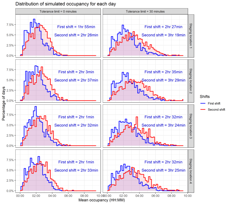
The intent of this project was to examine the spatiotemporal profile of incidents and suggest an initial plan for service patrol deployment for the arterials in Orlando. I developed a numerical simulations to evaluate performance of staged and centrally dispatched service program with one vehicle. The results indicated the service patrol program could result in a reduction of 36 to 45 minutes of clearance time on average per crash.
Visualization hidden layer projection of Artificial Neural Networks
Short description
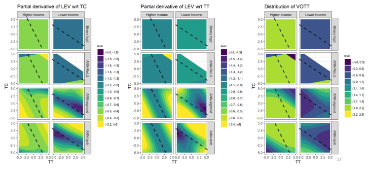
We realized that extracted some proportion of value of travel times from ANN were erroneous. This work shows one of the plot and a simple video showing the process involved in VOTT estimation. These videos were used to understand the issues and to communicate with others.
Florida Autonomous Truck-Mount Attenuator (ATMA) – Demonstration and Evaluation
Work description
This project hosted a demonstration of the operation and function of the autonomous truck-mounted attenuator (ATMA) in a closed loop environment as well as in an active work zone.
Clustering Pedestrian Trajectories obtained from LIDAR
Short description
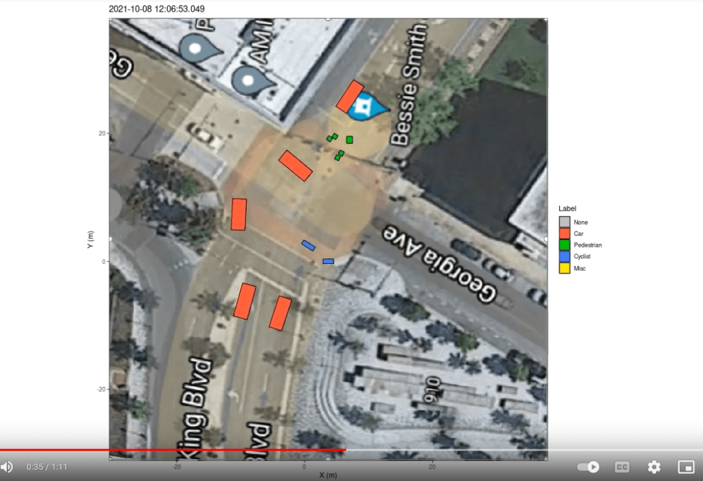
Processed LIDAR data contained positions, velocity and dimensions of detected objects. Pedestrian and cyclist trajectories were very noisy and clustering techniques were not able to efficiently cluster them. I had to visualize the data in detail to understand the nature of noise and possible approach to work with it.
